Graphing Covid-19

Disclaimer, I'm no expert, but I do know my way around an excel spreadsheet.
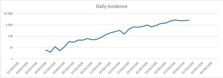
Here I have graphed the current UK Goverment statistics around Covid-19 cumulative cases as confirmed by viral PCR, and the daily incidence of new cases.
It's important to note the limitations of this data. In the UK, covid testing was initially widespread, before quickly being limited only to patient requiring hospital treatment. There was some flip-flopping about this at the time which, though never confirmed, I think in-part was to do with the speed at which we could increase testing capacity.
Official government guidance is that anyone exhibiting a temperature or persistent dry cough is to assume they have Covid-19 and to self-isolate for 7 days. These symptoms are sufficiently vague (such is the nature of the virus) that many people probably were isolating out of an abundance of precaution rather than an actual Covid infection, but all the better to overreact in preventing spread at this early stage.
In terms of behavior, this all became moot once widespread isolation, social distancing, and closing of non-essential businesses which could not conduct work remotely came into effect on 20th March 2020.
Therefore this data underrepresents the population Covid disease burden during this outbreak, ignoring those cases which were mild enough that people did not seek help.
However, assuming a relatively constant rate of hospitalisation within the latent covid-19 infected population, the trends in data could potentially be used as a proxy for the trend in the population at large.
Differences in testing methodologies between national healthcare organisations presents challenges when comparing disease incidence between countries.
Probably the mortality rate would serve as a point of comparison between national datasets, but still difficult when attempting to take into the difference in risk factors reflected in different national demographics (e.g. older age populations seen in northern Italy)
With those caveats in mind, here are a few simple charts of the UK disease burden.

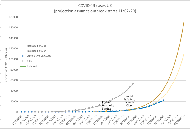
First, a graph showing the number of cumulative cases as reported by Public Health England, superimposed on expected rates of exponential growth for effective 'R' values of 1.24 and 1.25.
I did not use any specific methodology to come to these numbers, fitting curves by trial and error to the data earlier in the outbreak.
Also plotted are the dates of the UK government's switch from community testing to hospital inpatient only testing, and the date at which widespread social isolation was implemented.
Also plotted is data from Italian sources, which shows a much faster daily increase in detected cases, probably owing to the late detection of disease burden within that country in comparison to the UK, more widespread testing (though I have't confirmed this), and later population level infection control procedures put in place.
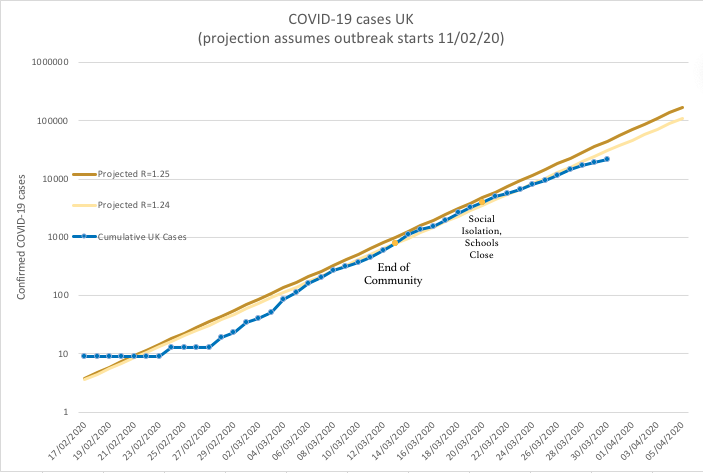
Below is the same graph again plotted on a logarithmic scale.

The data suggests a deceleration of new diagnoses of Covid-19 requiring hospital treatment, notionally stemming from the institution of strict social isolation policies. Wonderful news for policymakers and hospitals alike. Though the number of cases still increases exponentially, it is possible we will see the rate of new cases decrease further once the duration of isolation passes the virus incubation period.
Third graph, logarithmic plot of daily incidence, source PH england.

This data is tenatively positive, suggests social isolation has so far been an effective strategy, and provides hope that we can stem the tide of the pandemic to an extent.
Many others have discussed the longterm viability of this strategy. It is difficult to predict how best to way to manage spread of the disease in a way which preserves the hospital system's ability to care for the very sick, buys time to increase hospital capacity, balances tolerability of isolation by the general populace and industry, and does this all in an ethical way.
I will leave my hat out of this arena for now.
