Time Machine UI. What were you thinking?
I may be a little late to this party, but of the questionable UI changes as part of the new flat MacOS look, this has to be one of the worst. See if you can spot it.
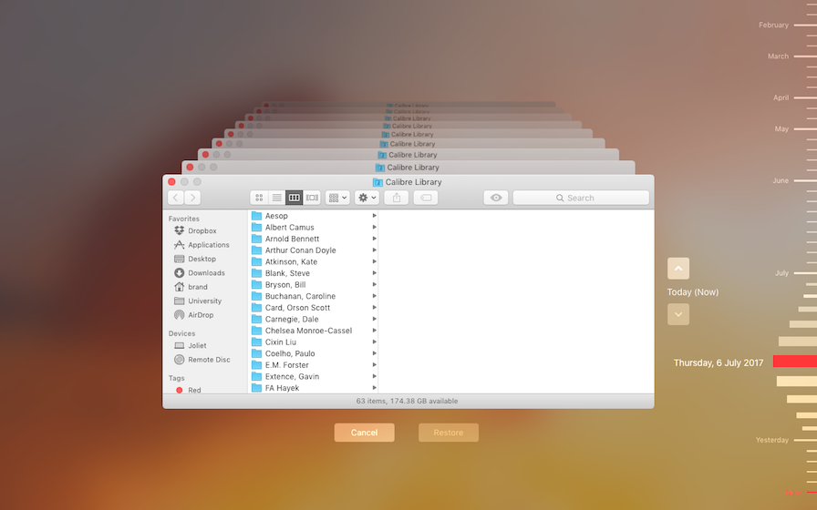
Here's a picture. Take a look at the right hand side.

Can you see the two different colours of bars on the right hand side? Look again. (Hint, I'm not talking about the red ones)
The colours are grey and and slightly lighter grey.
The need for different coloured bars came about when time machine gained it's local snapshot feature.
Since then, the colour indicates whether the snapshots are saved locally, or stored on an external hard drive.
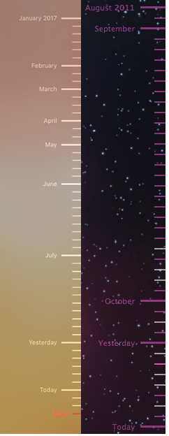
Pre-flat look, the colours used to be purple and grey. Clearly, the new colour scheme isn't much of an improvement.

New vs. Old for Comparison.
